Team
Yongwoo David Park
Role
User Research and Analysis
Lofi to Hifi Wireframing
Prototyping and Usability Testing
Created style guideline
Timeline
Jan 2021 - June 2021
Tool Used
Figma
PharmRx

Team
Yongwoo David Park
Role
Conducted User Research
Wireframed sketches on Figma
Created style guideline
Timeline
Jan 2021 - June 2021
Tool Used
Figma
Overview
Central Hub for Prescription
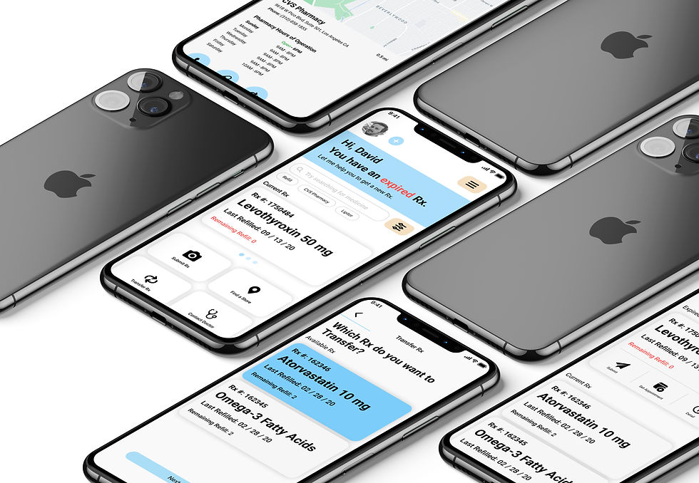
PharmRx is a healthcare app that aims to simplify prescription management. PharmRx can submit a prescription via photo capture, request refills, transfer prescriptions, and contact primary care physicians.

Goal

Healthy Lifestyle
In the United States, 66% of adults, more than 131 million people, take prescription medication. Unfortunately, studies from the Centers for Disease Control and Prevention (CDC) indicate up to 30% of new prescriptions are never filled at the pharmacy. Whether taking medication on time or submitting a prescription to the healthcare provider, PharmRx is designed to help users stay on track and achieve their health goals.
Senior Friendly
As individuals get older, the lens of their eye tends to weaken, resulting in difficulty in reading. In fact, in the United States, approximately 40% of seniors report having a physical or health condition that makes reading a challenge. To help older users navigate through a large amount of information, PharmRx designed a simple interface and large text, making it easier for seniors to identify and access the information they need.

User Research
Qualitative Research
To gain a better understanding of related products and services, I did some research to identify potential issues and areas for improvement in user experience.
Competitive Analysis
GoodRx

Affordable Rx coupon code
Accepted at most large pharmacy
Free
Subscription for additional benefits
Convenient communication with health care provider
Strength
Weakness
Inconsistent pricing
Exclude small pharmacy
Large selections of local pharmacy
Free
Direct communication with the pharmacist
Schedule for Vaccine
Access to health care provider
Strength
Weakness
Non standardized services
Not all local pharmacy are enrolled
No coupon for member
High customer loyalty with Wellness+ Program
Free
Refill and transfer Rx by scan
Manage family member Rx in one account
Digital coupon for member
Strength
Weakness
Mandatory sign up
Transferring Rx exclusive to Rite Aid pharmacy
Unclear indicator of Rx status
Largest pharmacy chain in the US
Schedule Rx for pick up & delivery
Free
Provide coupon for member
Access to health care provider
Strength
Weakness
Inconsistent application of the coupon
Exclusive to member
Not specifically for pharmacy
RxLocal

Rite Aid Pharmacy

CVS/Pharmacy

User Interview
I formed a group consisting of people of various ages ranging from 20 to 50 years old. Afterward, I conducted a short survey to gather their experiences when filling prescriptions at the pharmacy.
Findings
-
The user wishes to limit communication prior to obtaining their prescribed medication.
-
Alternative method to conveniently submit and track user prescriptions.
Research Synopsis
I was surprised by the diverse participants filled prescription in variety of methods. However upon researching, participants knew very limited methods of filling prescriptions because they weren't informed about the other methods or difficult to learn new way even though it would save them time.
User Persona
Based on the insights I gathered from interviews and online research reports, I developed three personas, each with distinctive attitudes toward technology.
Gains
-
Being a digital nomad
-
Improved work-life balance
-
Finding deals for her medication
Pains
-
Wasting time
-
Slow response
-
Fear of being uninformed of the current trend
"Everything can be done digitally! There are so many apps that provide coupons for my medication. I rather spend less time searching and spend more time practicing Yoga."
Ellie Riddle "The Tech Savvy"
Web designer, 27 Years, Female
Based in San Francisco, CA
Ellie is a remote web designer based in San Francisco.
She is passionate about her work and stays updated with the latest trends and services in her field by following IT influencers on social media.
She finds it inconvenient to search through multiple apps or websites for discounts on her prescriptions. As someone who enjoys practicing Yoga, Ellie wishes there was an easier way to apply coupons to her medication without sacrificing too much time.

"Everything can be done digitally! There are so many apps that provide coupons for my medication. I rather spend less time searching and spend more time practicing Yoga."
Wireframe
User Flow
Now that we have a strong understanding of our target audiences, I created an user flow to map out the user journeys in potential pharmacy applications.

Medium-Fidelity Wireframes
Basic wireframe to submit a prescription

.png)
Manage multiple prescriptions in a single screen
Refill (Left) & Transfer (Right)

Manage multiple prescriptions in a single screen
Refill (Top) & Transfer (Bottom)
.png)
Communicate with a Health Care Provider for further assistance

.png)
Visual Design
User Interface Style Guide
You may have noticed that blue is a common color used in healthcare apps available on both Google Play Store and Apple App Store.
Healthcare design often incorporates the color blue for its many benefits.
-
Blue is commonly associated with trustworthiness, safety, and hygiene, all of which are essential in healthcare.
-
The calming effect of blue can help alleviate stress and anxiety in patients who are already dealing with health-related concerns.
Although I chose blue as a primary color, research has shown that blue is one of the colors that elderly people struggle to identify due to color vision deficiency commonly affecting elderly individuals.
As a suitable solution, I decided to include a color level option at the beginning stage of the app so users can adjust to their liking.


Evaluation
Conclusion
As a designer working on this project, I had two primary UX goals in mind
1. Make the process of submitting a prescription easier for users.
2. Assist disabled seniors in checking their prescriptions through their mobile phones.
From working on this project, I've learned that problems can be solved if there is enough data to support them. That's why I prioritized researching and gathering information to design efficient processing steps.
If there was more time, I would have liked to perform A/B testing for submitting a prescription in developing the optimal user journey.
During my training to become a pharmacist, I observed an interesting phenomenon where some elderly people would physically drop off their prescriptions not because they were unaware of alternative methods, but because they enjoyed having company with the pharmacist to talk about their daily lives. I would like to further explore this knowledge and find an experience that satisfies the target group in the future.
Recent studies indicate that the elderly are now more knowledgeable about digital technology than they were in the past and are enthusiastic about learning new tech, particularly when it pertains to maintaining their health. Nevertheless, the accessibility of smartphone applications for seniors remains a difficulty that we, as designers, will need to address continually.


